Every time I use a new microwave, I get a little irritated.
No two microwaves ever seem to function the same way.
Sometimes, you punch in the time before you hit start. Others, it’s the heat setting first and then who knows what magic combo. A third might require you to incrementally hit additional minutes and seconds while the fourth will use some sort of dial.
The inconsistency inevitably means a new learning curve with each microwave. And anytime there’s a delay in food making it into my mouth, I’m cranky.
While elevators can be equally inconsistent for denoting the ground floor – is it L? 1? G?, at least someone had the foresight to add a * beside the button for ground floor so there’s a modicum of predictability. Thank you, elevator designers.
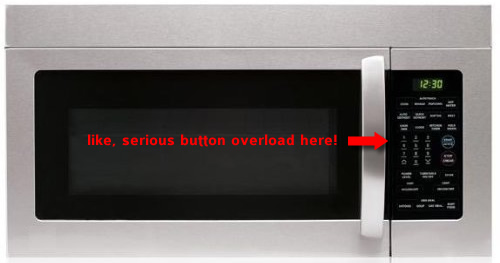
It occurs to me too that there are far too many buttons and far too many options on the average microwave.
When’s the last time you changed the power level? If you’re like me, the whole reason you’re microwaving is that you’re already hungry. I’m not going to volunteer to take twice as long and microwave at 1/2 speed. And have you ever used the “casserole” button? Yeah, I didn’t think so. 🙂
Part of the popularity of Apple products is simplicity in design.
I think microwaves can take a page from their book. Let’s do some plagarising.
What if we took this microwave –

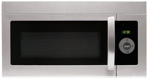
And instead, put an ipod style wheel on it?

Start, stop (reset), dialing to set cooking time and setting the clock is about all I need. Four things. Seriously, given that most things can be microwaved in 3 minutes or less, it should not take me 3 mins to figure out how to use any microwave.
There. I feel better already.

